Sunday, December 16, 2012

Self Portrait and Portraits Part II AND Rules of Photography Part II

1.) 9 - Use props! Are you a dad and a rocker? Bring your kid and your guitar. Are you a photographer? Add camera gear. Painter? Paint. Poet? Words. Make-up artist? Guess… You get the idea.


2.) Predicting Relationships Within the Frame
A great deal of people photography is understanding human nature and being aware of how people usually react in given situations. If someone is sitting in a café he will usually look up when the waiter approaches. People will generally smile when they see a baby or open a present. Crowds rise when a batter smashes a ball that looks like it's headed for the seats. Think about the situation you are photographing and how people are likely to act in it. Then prepare yourself for the moment.

3.) You can create an especially revealing self-portrait by adding personal memorabilia surrounding your mirrored image, such as photos of yourself at various stages of your life, or anything that tells the viewer about your interests. Besides a mirror, a window can sometimes offer a reflective surface for you to capture your own image.
Environmental Portrait
I really liked this photo because it's expressing their lifestyle. Their hangout, their interests, hobbies, who they are.
I thought this photo was super rad because of the coloring but it's something I feel like I can relate w/.

Photography Self Portrait
I think his photo is REALLY cool. I like how the wind is blowing & it looks like she's blowing w/ . A very cool picture.

I thought this photo was great b/c even though theres other people in the photo, it's clear who & what the subject is.

Casual Portrait
She's gorgeous, It's doesn't look like she put alot of thought into her photo, she looks happy.


I liked this b/c it seems that the couple is unaware that they're being photographed.


My plans for my self-portrait is a photo of myself, i want to shoot it in my room b/c i have blue walls or maybe my sisters  room b/c she has  pink walls. I was thinking maybe I could take it in my backyard on a wooden swing my grandpa made for my sisters & I. I was also thinking in my kitchen b/c it's like really sunny & bright in there . I could also take it out too places i like too go so it can be simply me in my most comfortable enviroment. It's most likey too be a casual photo. I want too take ALOT of pictures & then choose the best one, one that has as many rules of photography as possible. I think I'll have the best luck w/ simplicity & maybe avoiding merges.

Rules of Photography
My Favorite Movies : )

Depth
Nick & Nora's Infinite Playlist

Rule Of Thirds
Whip It

Balance
The Breakfast Club

Framing
Scott PilgrimVs The World

Symmetry & Patterns
Bee Movie

Lines
Sixteen Candles

Cropping
The Wedding Singer

Background
Never Been Kissed

Avoiding Merges
The Lost Boys
Viewpoint
Grease


Thursday, December 13, 2012

Aperture, Shutter Speed, ISO

F2.8 Photograph

1.) The Eye
2.) The smaller the Aperture the larger the f~number. The higher the Aperture, the smaller the f~number.
3.) It brings all the foreground & background objects into focus.

Shutter Speed

High Shutter Speed

Slow Shutter Speed

a.) High Shutter Speed
b.) Slow Shutter Speed
c.) Slow Shutter Speed
d.) Slow Shutter Speed
e.) High Shutter Speed
f.) High Shutter Speed

a.) Slow Shutter Speed
b.) Slow Shutter Speed
c.) High Shutter Speed
d.) Slow Shutter Speed
e.) Slow Shutter Speed
f.) HIgh Shutter Speed

2.) ~Auto is when both shutter speed & aperture are automatically selected by camera.
    ~ Aperture Priority is when you set the lens aperture while the camera automatically sets a shutter speed.
    ~ Shutter Priority is when you set the shutter speed & the camera automatically selects the aperture.
   ~Manual mode is when you set both the shutter speed & aperture manually.

ISO 200


ISO 3200

1.) The advantages wopuld be the bright lights on a football field at night or the lighting of the indoors helps make the photo have less grain or "noise".

2.) You should use a low iso when there is plenty of light.
3.) You should use a high iso when there isn't enough light for the camera to be able to capture the image quickly.
                                                                         Sim Cam

*f4- 1/125 The couple is visible but the background is blurry.
*f5.6-1/60 The couple is visible & the background is still blurry but not as blurry as before.
*f8-1/60 The couple is visible, the background is blurry but the photo is dark.
*f11-1/60 The couple is visible, the background is less bluirry, but the photo is dark.
*f16-1/30 The couple is visible, the background is more clear & the photo is still dark.
*f22-1/15  The couple is a little blurry, the background is clear & the photo is dark.

-The couple looks extremley blurry.
 -The photographer can raise the shutter speed.


Wednesday, December 12, 2012

Lytro Warm-Up

1.) The focus of the subject switched.

2.) The camera can refocus the subjects in the photo once the photo the picture is taken. On a computer or mobile device, you can shift the picture.

3.)The photographer would have to know too be able to capture a photo that would look good, either focused on one subject or the other.

4.) I think it is worth the money. It's pretty dope.

Fashion

1.) The made her neck longer & skinnier, they made her eyes & lips bigger & made her cheekbones pop out more.

2.)I don't think it is b/c it's basically lying, but I can understand that it might help them sell their product. So I guess I'm neutral about it....

3.)I think it would be the worst if they manipulated the photo w/o the models or I guess subjects permission.

4.) Ok Changes would be messed up hair, anything embarrassing or something that throws the photo way off. Not ok changes would be change in physical features, or like I said before anything done w/o the models or subjects permission.

5.)  I think that fashion photography might have more pressure & more focused, while photojournalism, you might be able too take pictures of whatever & there isn't as much pressure.

6.)Photojournalism is taken right in the moment & it's reality being captured in a single shot, while fashion photograph is photoshopped & manipulated which makes it not real.


Wednesday, November 28, 2012

American Soldier


A.) I Think Picture 30 Was The Most Powerful Because Ian Is  Standing There Around All The Other Soldiers & While They're All Getting Ready, He's Just Standing. I Think He Might Be Admiring Himself For His Accomplishment.

B.) Set #1 At home in denver Image #1 - #9
     Set #2 At basic training Images #10-#29
     Set #3 in Iraq images #51-#70
     Set #4 back in denver#31-#48 & #71-#83
I think the most powerful set was when he was training, because he was becoming the solider that he became in the end.

C.) They tell a story by showing where he started & led up to how his life now is.

3.) A.) Past Tense
     B.)  They Describe & give the audience a better understanding of the photo.

4.) Image #24
    Ian prepares for a practice mission w/ his team members (from left to right) Matt,Jonah, & Ryan.
   Image #67
   Ian & friends dog pile & play around on a quiet, boring evening.
   Image #75
   Ian Says Final Goodbyes Too a good friend of his, unsure if he'll ever see him again.

5.) -It Shows & expresses Their Feelings & thoughts more form their perspective, not the journalists.
    -Videos Give You A more inside look of the characters & their actual personalities then what you would see in pictures & in The DenverPosts They have colorado video which explains what might interest you.
   -Photos are better because they're brief & in the DenverPost, They have Media Center Galleries Which is really eye catching & interesting.

Monday, October 29, 2012

Abandoned Theme Parks


1.) If I  were to go to one of these theme abandoned theme parks w/ a camera I would most likely settle for Lincoln Park in Dartmouth, Massachusetts. I really liked the altogether fact of taking photos of abandoned theme parks but I chose this certain theme park because the broken wooden roller coasters.

They just caught my eye & stood out way more than the other theme parks.I think I could take lots of pictures at that particular theme park using all of the rules of photography.

2.)

3.) - 

Thursday, October 25, 2012

Funny Captions

A local boy attempts to pet a crane. He runs up & without warning the bird turns & bites him.

A boy at a zoo ran up too  crane & the crane turned & bit him on the face.

A bullied boy gets his head stuck into a chair.

A boy playing truth or dare sticks his head in a chair but has difficulty pulling out.

A young man attempts a new kind of smoking. This is his first time.

A man smokes this way for the first time. If your wondering, he's ok just still a little woozy.

I'm Sorry But I'm Not Very Funny, Especially When I Try.


Friday, October 19, 2012

Great Black and White Photographers Part 3


1.) When I was first looking at the photos, the first thing that caught my eye was the fact that they were black & white & the creativity of the photographers. There was so many that I liked but I settled for those three because they were favorites of mine, & the subjects are not really something someone would want to take a picture of.

2.) I see the the white house, the grass in front, President Kennedy w/ a half smile on his face.
     I smell the freshly cut grass on the white house lawn.
     I hear the the flash of the camera, & maybe people in a distance.
     I taste the sickening taste of cut grass.. you know how when you smell it, at the same time you can sorta taste it?
     I feel the warmth of the sun beaming on me.


I see the beauty of Marilyn Monroe w/o make-up although she does looks exhausted.
I smell her perfume. ( She looks like the perfume wearing type)
I hear silence, she isn't talking.
I taste the bittersweet taste of the silence & the side of her many people don't see.
I feel the peaceful silence. The tiredness of the ora she's giving off.

3.) I would like to make a power point so I can make it creative & have more use of my imagination.


Monday, October 15, 2012

Academic Shoot reflection

1.) Well it was difficult to find something altogether..
2.)I focused most on the focus .
3.)Take so much more better pictures & focus a lot more on framing.
4.)The balance one.
5.)Balance & simplicity& probably lines.
6.)Avoiding Merges
7.) Rule of thirds !!!I guess I Can try to google pictures w/ that rule maybe then I'll have a better understanding.

Framing


1.)Not very well at all.
2.)Well it's supposed to be mrs. Garcia-Mata
3.)No, not at all.
4.)Taken a better photo altogether.

Avoiding Merges

1.) Yes.
2.)The boy that's studying
3.)Yes I think so..
4.)I don't like how there's another person in the background.

Balance

1.)I think I followed it pretty good.I think this was the best photo i took.
2.)The boy & the girl.
3.)Yes, I think it's pretty clear.
4.)I think the balance is fine but that chair w/ the coat on it kinda throws the photo off.

Rule of Thirds

1.)No I Don't think so....
2.)Mrs. Garcia -Mata
3.)I think it would probably be the first thing they would look at.
4.)I could have gotten her more in the middle so it was more obvious she was the subject & two other people could be on the outside of her.

Simplicity


1.) Not Great but well enough.
2.)The pencil & paper.
3.)Yes, I think so.
4.)Zoomed in much more.

Lines


1.) I think the rule is followed ok, not great but Lines are visible.
2.)The subject is the books, the black ones specifically.
3.)I honestly think that someone who looks at the picture will mistake it for one of the boys or maybe the blue binder or something else.
4.) I Probably could have gotten in a position or maybe taken a better picture where lines were VERY obvious.


Thursday, October 11, 2012

NEXT

1.) The theme  could be anything but probably something academic ???
2.)We should use the regular cameras !!!!!!!!!!!!!!
3.)Somewhere where lots of people will see it !!!!!
( I Am Def. Looking Forward Too This !!!!)

Africa and Mural Project preview

This was a beautiful powerpoint. His Photos Were really really good. I liked how he followed the rules of photography & it was really interesting.
This photo was my absolute favorite because it looks really great & it just seems very peaceful & the lion is just like in a perfect spot & it's just so awesome & beautiful& amazingly legit all at the same time.
The most evident photography rules that are evident to me are simplicity because it's just the lion alone & theres nothing in the background besides the grass & the sun but the lion is the first thing that catches your eye. The second one I see is framing because the clouds are framing the top of the photo. And the last one I see is Avoiding Merges because it just the lion by itself & nothing important is being cut-off.

4.)a.) He uses a Pentax 6111 w/ only two fixed lenses.
    b.)To show the treatment of the african wildlife.
   c.)To show people how hard it i for the animals in Africa & how he wants us to see so maybe we could somehow help.
   d.) " What I'm doing feels slightly insane in its impracticality, especially coming from being a director where you're a control freak & w/ animals, you're anything but in control."

Tuesday, October 9, 2012

Academics & Community Service.

The photo I chose is called "Junior Year" it has a boy sitting in a library w/ about eight books titled ACT & SAT. I'm guessing he's studying.
1.) I picked this photo because it's super rad & it's black & white which is my favorite kinds of pictures , plus it's a really good picture.
2.)The most obvious ones I see simplicity, framing, & balance.


1.) I think it won't be that hard, but I don't really know exactly where but I'm sure I could find something good somewhere : ) .
2.) I think Ms. San Miguels class would be a great class & Maybe Ms. Garcia Mata's
3.) I will try to use the six rules of photography mainly simplicity & balance.

Friday, October 5, 2012

Filling The Frame

This photo was titled "Around The Pole".
This photo interested me because the name wasn't specific & it made me wonder what they might be doing.They could be praying, or maybe meditating, or posing for a good picture ?.. I'm not sure but it is a good photo : ) .


Action & Emotion

This photo was called water lab. It's the best for "Action & Emotion" because there's a combination of both. Action is the water, duh & emotion is the girls faces.

The Story

The photo was called feeding the homeless.
This photo shows students feeding the homeless obviously, & I think that the story behind it is maybe the students wanted too help them out, & make there day by giving them a filling meal : ) .

Wednesday, October 3, 2012

Post shoot reflection

1.) I guess the most difficult one for me was happy because I didn't want to get something ordinary but I couldn't find something different so I just settled for a guy smiling.
2.)I thought mostly about the balance & trying to get the photo to not be blurry.
3.)I would focus more on simplicity, that's one of the main one but I would try to follow the other rules as well.
4.)I would take the same photo of metal but maybe a little bit more zoomed in so that theres nothing in the background.
5.)I think for the Happy I achieved Simplicity but the rest I think I could have done better.
6.)I Am interested because i think this time i could do much more better & hopefully achieve the rules of photography better.

Monday, October 1, 2012

The Falling Man

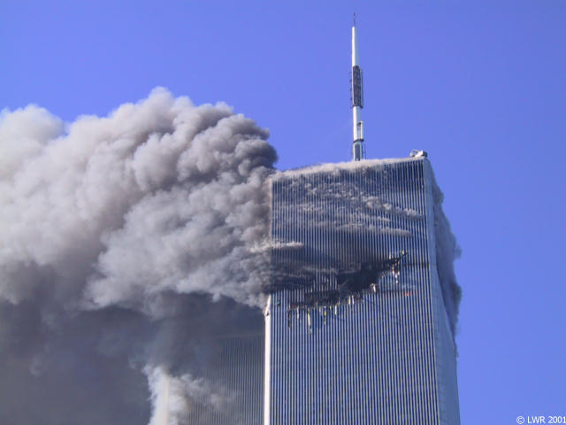
I think that the fact that people were jumping out of windows is really unpredictable but when i was reading the article, I realized that if I had been unfortunate enough to be in that situation I would have done the same. I think the falling man is really brave & I actually admire him. It's really a shame nobody knows who he was. He is someone who is basically a historical figure of that awful series of events on September 11, 2001.

Avoiding Merges

I chose this photo for Avoiding Merges because it captures the whole subject w/o cutting anything or anyone out. The debris & the black & white add boldness.

Framing

I picked this photo for framing because the pictures of the ones whose lives war taken that day frame the subjects of the photo who are looking at the other pictures. This is a awesome picture.

Balance

This photo is a good candidate for Balance because it's very leveled & It looks as if the subjects are in the middle of the photo despite all of the chaos that was going on.
                           

Lines

I chose this photo for lines obviously because there's lines but also because the lines are repetitive, they're in a great angle & The debris at the bottom make the lines stand out more.

The Rule Of Thirds

This is a good photo for The Rule of Thirds because from where the photographer took the photo, there's still room in the street where the people are running. Also the Welcome to Manhattan sign is in a good spot in the picture.

Simplicity


I chose this photo because it simply captures the building & There isn't any background besides the blue sky but that's it. I think this photo really represents Simplicity.

Tuesday, September 25, 2012

Unusual & Interesting Photos

Part 1


I think his work is incredibly odd but nonetheless magnificent. : )
I think that maybe he used slow shutter speed or he might have photoshopped it ..
The buildings here in downtown Austin would make really good photos.. But theres tons of buildings that would make good photos but if i were to choose one it'll probably be a random building that nobody knows about. Let it be known of. : )


Part 2


I chose this photo because it just stood out to me. Theres two things going on at once & it's a really good shot.
This photo was in the Art Of Entertainment.
It got 1st place !!!!
What caught my attention was that theres people that have company & on the side is a girl sitting by herself.You would normally just take a picture of the three people but the photographer included that girl, it's ... different.
I'm pretty sure it weighed a lot in the judges minds. I'm sure they were as in love w/ it as I am.
The photographer probably had to zoom out to get the picture right & maybe try not to be obvious that they were taking the  girls picture.
                                                    Part 3

-We need flash or some other aid to get both lightning situations correct.
- What this can teach photographers is to never stop looking for the right angle to take a photo.
-It is important to be able to see repeated patterns in photography and get good photos of them.


i think the photographer used the suggestions pretty good. In a way they have the same meaning but at the same time they're completley different. I REALLY like street art & graffiti.They have meanings behind them & they're just absolutely beautiful.