
Wednesday, February 20, 2013
Friday, February 8, 2013
Choice Sheets
I would like too be in newspaper b/c journalism really interests me. My dream job would to be a concert critic for the Austin Chronicle. That explains that I like going to events, taking photos at the event & giving description of the event. I know that it's every six weeks, but I work really well under pressure, strangely. But I really want too be in newspaper & I hope I'll be able too be in it next year.

http://thedowneylegend.com
I found this newspaper as one of my most favorite spreads.

My favorite yearbook spread
I found this newspaper as one of my most favorite spreads.


Thursday, February 7, 2013
http://www.lightstalking.com/34-photographs-of-cathedral-and-church-interiors-that-rock
1.) The website was basically the inside of churches. Most of the time, the photographer might break the rule "Converging Verticals". But in most cases it's okay b'c it's simply just for the pleasure of enjoying the photo itself.

c.) This photo was taken by HTO3 on Flickr ...
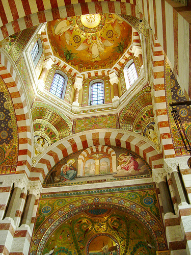
a.) I chose this photo b/c it really pretty & it's just something that anyone I'm sure would stop for at least a second & look at.
b.) Hmm.. I can see viewpoint, lines & patterns & that's about it.c.) This photo was taken by HTO3 on Flickr ...
http://blog.tomolesnevich.com/personal-projects/#nyc-by-bike
1.) There wasn't much said but the obvious subject of the project was the camera was set on the back of a bike & while the person riding the bike rode around on it, shots are taken. I think it was like, a REALLY rad experiment : ) .

a.) I chose this picture b/c it just stood out to me. It's bright.
b.) I see viewpoint.
c.) This photo was taken by: Tom Olesnevich

a.) I chose this picture b/c it just stood out to me. It's bright.
b.) I see viewpoint.
c.) This photo was taken by: Tom Olesnevich
http://www.flickr.com/photos/kevinday/sets/775271/
1.) The author of the article didn't have a lot to say about the article, but it was titled "My friend, the dead tree." This tree has fascinated this certain photographer ever since he became intrested in photography.

So... this is like the biggest I could get the picture w/o it having like really blurry stuff.
5.) a.) I picked this photo b/c it's hard too see but the picture is black white obviously, but there is the reflection of the tree in the water. The picture may look a bit dark or sad but it's a really good shot.
b.) I see balance for sure, but maybe the clouds on top are can be framing.
c.) This photo was called Missed & it was taken by: Kevin Day
http://www.lightstalking.com/lens-flare
1.) This website was about the use of lens flare. Flare is light scattered within the background of the subject. It was usually avoided but now photographers don't mind as much b/c it adds some creativity to there photos.
4.)

4.)

5.) a.) I posted this photo as my favorite one b/c the lens flare is really rad. I like how the subject is barely seen & how theres a dark side & a bright side.
b.)The rules of photography that i see in this photo are obviously simplicity, rule of thirds & maybe background.
c.) The photo was untitled but it was taken by Erin Purcell


Tuesday, February 5, 2013
Magazines Part 2
Early Magazine Covers
These main attributions were based mostly on news & things that were happening & weren't exactly for entertainment but mostly just to inform people. They usually didn't use models & when they did they were simple & gave no destruction on what was inside or what there was to read about within the magazine. In most cases, it was rare to have a magazine cover in the first place. They usually would just start on the first page like a newspaper.
The Poster Cover: Pictures That Need No Words
Ranging between the 1890's & 1960's, the most popular type of magazine was the poster cover. These magazine covers looked like they were printed to be framed. Most poster covers defined the main article of the magazine. For example, An outdoor magazine cover may show a wild animal outside on the cover or a music magazine may display a famous musician. These covers were used to strike an audiences attention & attract them too there interest.
Pictures Married To Type
This was the begin of "integrated"covers. These were magazines covers that had a large title in the background & the model's face overlapping it.There were two kinds of cover lines. This would be primary & secondary. Magazine covers were experimented & experimented & some covers were even unusual, mostly in the fashion industries. Cover lines became a worldwide phenomenon in the magazines throughout the centuries.
In The Forest Of Words
In the 21st century, cover lines became as important as cover art. This caused the image of the model to look smaller so that the cover lines explaining the contents inside could be acknowledged as well. In most magazines now, images & cover lines usually overlap each other.
Monday, February 4, 2013
Best magazine covers 2012
1.) Formal
2.) Formal
3.) Informal
4.) Informal
5.) Formal
6.) Formal
7.) Formal
8.) Formal
9.) Formal
10.) Formal
11.) Formal
12.) Formal
13.) Formal
14.) Informal
15.) Informal
16.) Environmental
17.) Formal
2.) Formal
3.) Informal
4.) Informal
5.) Formal
6.) Formal
7.) Formal
8.) Formal
9.) Formal
10.) Formal
11.) Formal
12.) Formal
13.) Formal
14.) Informal
15.) Informal
16.) Environmental
17.) Formal
Friday, February 1, 2013
Magazine Tips
-Plastic bagging is essential
-The six functions of cover
Familiar recognition from issue to issue (that’s the brand)
Emotionally irresistible
Intellectually stimulating, interesting
Arousing curiosity
Efficient, fast, easy to scan
Worth the investment of money and time the four ways to judge a cover
-Avoid a weak cover
The screen is the wrong size, no matter how big it is. You can’t see it intimately as if it were in your hands.
It lacks scale because it is isolated in its own magic electronic world, so you have nothing real to compare it to. You can only guess at type sizes and hope they’re OK.
It glows in vivid colors that will inevitably turn disappointingly dull when printed in ink. A hard-copy printout may be closer.
Worst of all, it is virtual. It is just an illusory likeness of the physical paper product that your potential buyer will ultimately be holding. If you are producing magazines on paper, think and remain conscious of “paperness” all the time.
Know the four ways too judge a cover
In my magazine cover, I want to try to get something attracting & looks somewhat interesting.
I want something that won't be too hard to scan.
I would also like for it too be elegant, but unique-ish.
I want too have a background but not a background that's too distracting that it would that it would take off the focus of the main subject.


Photoshop Notes
Photoshop Notes
Nestle- tools are stacked on each other- to access those
tools you have to left click & hold.
USE COMMAND KEYS!!!!!!
Command + = zoom in
Command - = zoom out
Command o = copy
Command c = copy
Command v = paste*** Command z = step back
Command s = save
Command p = print
To turn an image go to
>Image>Image Rotation
CW & CCW
CW= clockwise CCW= counter-clockwise
180=1/2 rotation
>Image>adjustments>levels
Channel Blue
Channel Green
Channel Red
Moved just the black & white hershey’s kiss
Channel RGB- moved just the brown hershey’s kiss (Just A
Little lighter)
Crop
Always crop to 300
Resolution – for now do not crop selectively – crop the
ENTIRE image
SAVE – you do not have to rename the image at this point.
Save often & regularly.
Close the image
Subscribe to:
Posts (Atom)